Tableau
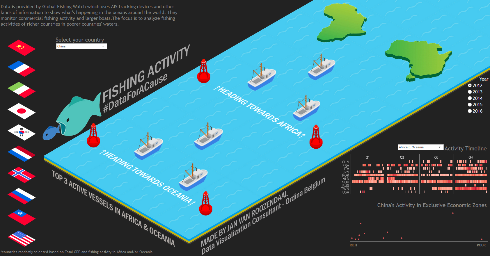
Worldwide Fishing Activity
Created for #DataForACause in February 2019 to help the NGO Global Fishing Watch.
This impressive isometric visualization shows the fishing activity of various countries in the oceans around Africa and Oceania. Hovering over each flag provides summary information about each country, which can also be selected from a dropdown menu.
Once a country is selected, the visualization illustrates how many of that country’s fishing vessels are active in the oceans either near Africa or Oceania in the specified year. Hovering over a boat shows where that boat has been actively fishing in a tooltip map together with some summary information. To the right of the fishing map is the quantified fishing activity for all boats of that country for the given year. The year can be changed on the right side. Beneath this is a scatterplot showing where the fishing activity occurs; in poor or in more wealthy countries (by yearly GDP).
Click here to explore the interactive visualization.
DEMO
DEMO
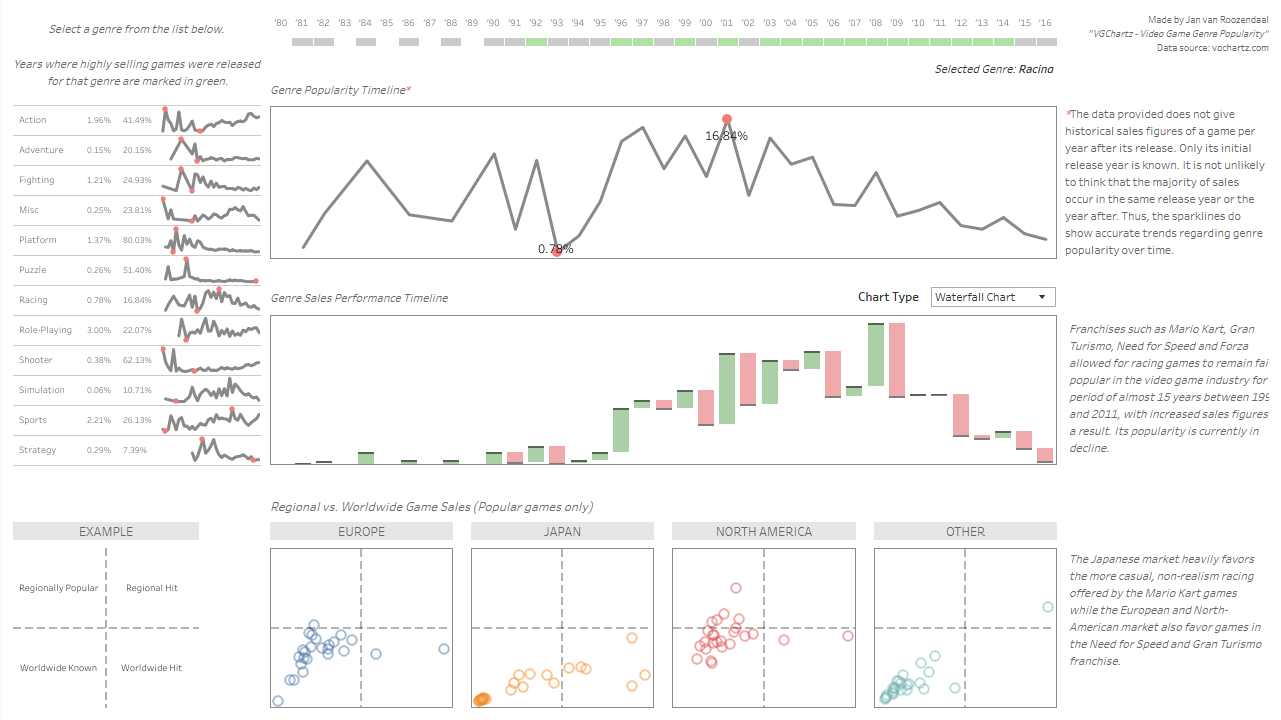
Historic Video Game Sales
This dashboard shows market analysis of multiple genres of games released between 1980 and 2016. While the layout of the dashboard remains quite simple and has this 'Tableau'-esque look, it demonstrates the effectiveness of the plots and storytelling potential regarding the evolution of the sales and overall popularity of the selected genre.
The dashboard can be broken down into four sections: (a) the sparklines and summary statistics on the top-left for each video game genre; (b) the popularity trend in terms of sales figures of the games compared to games from other genres; (c) the evolution of sales figures within the genre; and (d) a scatter plot for each major market (North America, Japan, Europe) with each data point representing a specific video game title. The colored timeline at the top of the dashboard shows for each year whether a succesful game was released within the genre.
Click here to explore the interactive visualization.
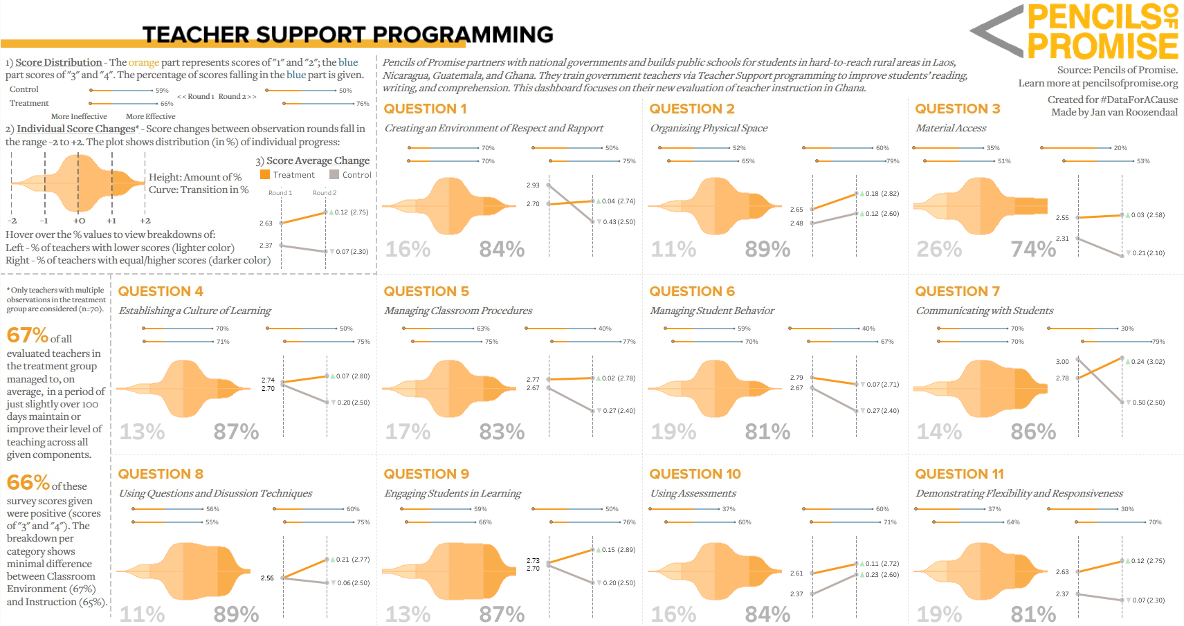
Teacher Support Programming
Created for #DataForACause in April 2019 to help the non-profit organization Pencils of Promise with evaluating the effectiveness of their instruction program to aid teachers assigned to primary schools in Ghana. Data of teacher evaluations was provided in survey format.
The 'hero' element of the dashboard is the customized violin plot. For each topic, analysis is done on the basis whether the teacher's score has improved between the two evaluations. Comparison is done between a control group and a treatment group.
Click here to explore the interactive visualization.
DEMO
Borderlands - Weapons Creator
Finished in November 2018. The gameplay of the games from the Borderlands™ franchise is heavily based around the element of finding randomly generated guns. Each gun can be decomposed into different parts, and multiple gun manufacturers from within the game's universe may supply a specific part. Each manufacturer adds a different effect to the gun, so veteran players may want to seek a specific combination of weapon parts to fit their playstyle.
The main problem was that most online tools did not make use of visual elements to aid players into knowing how their preferred gun would look like. This is important as the game did not supply information which manufacturer supplied which weapon part. With the added features included in the releases of Tableau 2018.2 and 2018.3, I was able to make use of transparant images and custom buttons to create an unique interface for navigation. With this dashboard, players not only knew which parts they were looking for but also how their gun would look like, aiding them in their process of acquiring their best gear.
Click here to explore the interactive visualization.
R
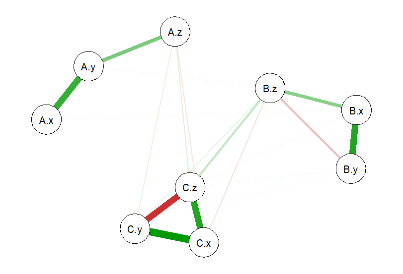
Influencing Network Models
This portfolio item is related to my latest Master's thesis written for Ghent University and is entirely focused on network visualizations and their embedded challenges of estimating them properly.
The main idea of the R-project is to generate random data for a particular number of groups of variables (here A, B, and C) and create network visualizations from them. Looking between the variables X, Y and Z along within one group, you can notice that the relations (correlations) between them is different per group.
The R-code utilizes the theory of interaction information, which is covered thoroughly in the thesis in case you are interested. Basically, the R-code can be used to manipulate the number of groups of variables generated, how the relations of variables within each group should be, and which correlations should be forced between variables across different groups.
As you can imagine, depending on the layout of the network visualization, you may have different ideas on which variables are considered more important to you given the type of analysis you are performing.
Click here to explore the GitHub repository.
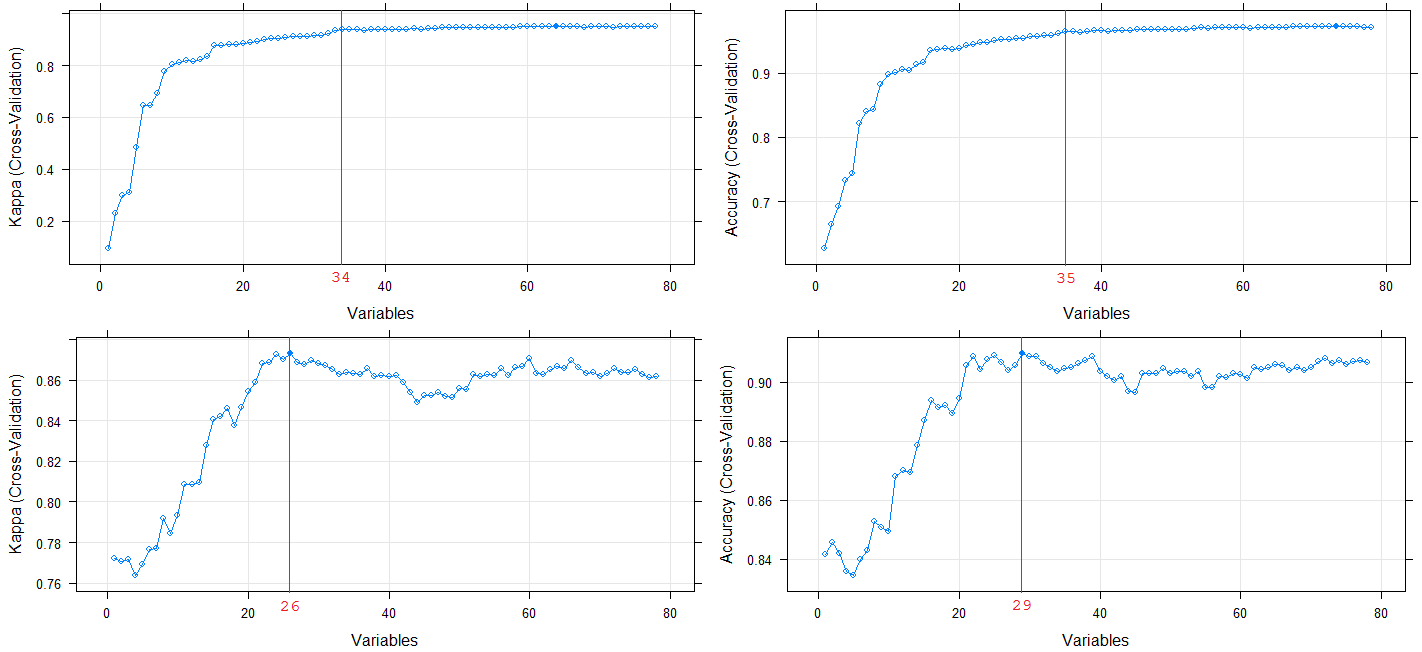
Classification - Cell Mitosis Cycle
Done during the course Big Data Science at Ghent University. A dataset was provided with 213 features total retrieved from image profiling. Each record had to be classified into one of five phases of the cell mitosis cycle. The main challenge was that the training data was highly imbalanced: about 99% of the training data was classified into one phase.
The R-project is mainly focused on machine learning techniques to handle with imbalanced training data sets and dealing with high-dimensional data. My targets were to (a) create a classification model that would achieve a sensitivity score of at least 50% for all phases, including the extreme rare ones; and (b) create this model with at little featured required as possible.
The picture on the left shows the progress of eliminating one feature at a time to find the best combination of high model performance and dimension-reduction of the features. These processes took about 45 minutes each.
I used XGBoost, linear support vector machines and k-nearest neighbors as machine learning algorithms combined with dimension reduction and SMOTE. I managed to achieve my goal of creating a decent classification model using only 14 out of the original 213 features.
Click here to explore the GitHub repository.
Python
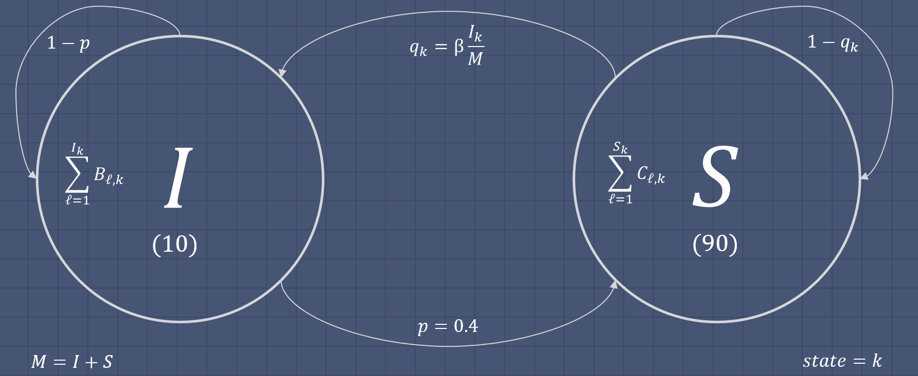
Simulating Markov Chains
Done during the course Computerintensive Statistical Methods at Ghent University. Given as an assignment during the COVID-19 outbreak, the goal was to simulate an epidemic within a given population with formulas given for the chance of infection and recovery. The disease used for the simulation was not considered to be lethal, and any person previously infected would not become immune.
This item showcases my ability of writing simulation programs and knowledge of Monte Carlo Markov Chains (MCMC). The assignment was also heavily focused on understanding prior and posteriour probability distributions of state transitions, in this case from being susceptible to the disease to being infected or vice versa.
Click here to explore the GitHub repository.
Academic
Master's Thesis - Ghent University
Written for Ghent University in the academic year 2019-2020.
Click to view PDF
Hosteb by libstore.ugent.be
Master's Thesis - IMMIT
Written for Aix-Marseille Université, University of Turku and Tilburg University in the academic year 2015-2016 for their joint Master's programme.